How the Updated Ratings Provides a More Accurate Representation of Schools' Performance
- Apr 11, 2024
- 1 min read
Since its inception in 2020, our website has been a go-to resource for comparing the performance of primary and secondary schools across Australia. We've employed a simple scale of 0 to 10 to rate schools, with the highest-scoring school receiving a perfect 10 and the lowest-scoring a modest 0.1.
The aim has always been to ensure a fair distribution of schools across the rating bands. Ideally, there should be roughly the same number of schools in the lowest bands (0-2) as in the highest bands (8-10). However, one major flaw with this approach became apparent: the difference between, say, a 10 and a 9, and a 6 and a 7, could be significant. For instance, the gap between a score of 10 and 9 may be far wider than that between 6 and 7, yet the old ratings treated them equally.
In response to this challenge, we've undertaken extensive research and validation to refine our rating system. The solution? We're now using Z-scores, which compare each school's performance relative to the mean and standard deviation.
The outcome of this update is revealing. Our new ratings paint a picture of data distribution resembling a typical bell curve. The majority of schools fall within the 5-8 rating range, while only the very top performers achieve a 9-10 rating. Schools that were previously lumped with a modest 1-4 rating now find themselves more accurately represented, with ratings closer to the centre of the distribution, typically around 4-6.
 | 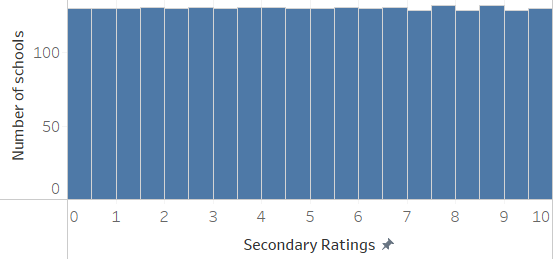 |
Under our new ratings, school distribution resembling a typical bell curve. | In the old ratings, schools are evenly distributed across rating bands. |
This revamped approach provides a more accurate understanding of school performance, offering users a clearer picture of how schools stack up against their peers.


Comments